


How important is a newsletter logo?
+ the women who are writing about nostalgia for The Wing, Scott's Tots, and more.

Good morning, everyone. I’m glad to see such a positive response to last night’s dispatch from the heart of Dimes Square. The comment section is especially fun this morning. Collaborating with young writers like
and Feed Me’s editorial assistant (who files stories from his college dorm) has been a real masterclass in scrappiness, speed, and curiosity at its most compelling.Today’s newsletter includes: a conversation with Jalil Johnson about his newsletter rebrand (something I’ve seen more and more effort go into on Substack), the women who are writing about their nostalgia for The Wing,
on Hate Read round two, a real Scott’s Tots situation in Brooklyn, and the 2010’s DTC darling brand turning itself into a cpg empire.“I thought about changing the name, because I wondered if it was weird to have a fashion newsletter without a fashion-y name. But the way I think about fashion, getting dressed, shopping… it’s never just about clothes.” -
Today is the last day for paid readers to ask Punchbowl News co-founder Jake Sherman questions for our next Guest Lecture. I texted him last night about my favorite question in the chat so far — “I'd like to know about Jake's daily routine. Guy seems like he doesn't sleep. But he has to to perform.” Curious how he’ll handle that…..
📱 Have a story you want Feed Me to cover? Text the anonymous Feed Me Tip Hotline: (646) 494-3916 📱
How important is your newsletter’s logo?
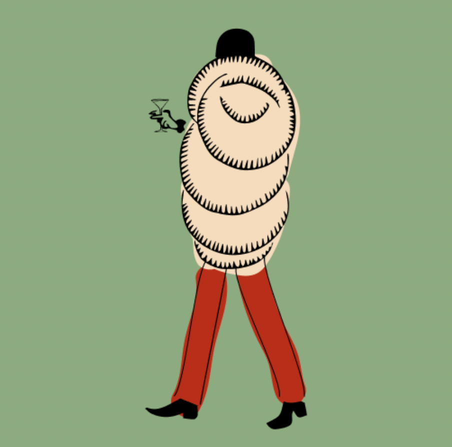
I sat next to fashion writer
a few weeks ago at a dinner party that Substack hosted with The RealReal. Towards the end of the night, he showed me the redesign he was working on for his newsletter, . He zoomed in on his iPhone screen to show me the olive-colored swatches, intricate illustrations, and references to the 1989 Rizzoli book, Jocks and Nerds (which you can buy used on Amazon). I couldn’t wait to see it on the big screen (my computer). The rebrand officially went live yesterday, so I asked Jalil to tell Feed Me’s readers a little more about why he wen through this process:“For my own logo, I wanted to capture something that felt like a relic from a bygone era, yet still appeared modern. That’s what drew me to the 1920s. I collaborated with Roslyn Fok to bring this vision to life. I mostly sent her illustrations by Erté, which he created for Harper’s Bazaar covers and 1920s advertisements. There was also one image I kept returning to, a piece called The Yell by John Held Jr., which appeared in the January 16, 1954 issue of The New York Times Magazine. It references a trend from the ’20s, where Ivy League men would wear raccoon coats to go watch football and other outdoor sporting events.